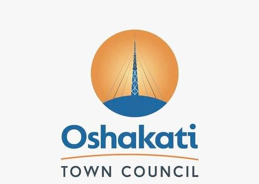
The Oshakati Town Council unveiled its new logo on Friday, giving it a new look and identity.
Speaking at the event, Oshakati Town Council’s chief executive Timoteus Namwandi said the rebranding is intended to place the council in a world that is rapidly changing in terms of technology and innovation.
“This is an enormous change in terms of redefining our identity and repositioning ourselves so that we are able to respond timely to our customers’ needs,” Namwandi said.
Namwandi added that the town has taken a strategic path of redefining itself to continuously improve customer service.
“Our vision is to be an industrialised and commercialised preferred city in Namibia. And we want our stakeholders to think how you will be able to contribute in terms of how to achieve that specific vision,” he said.
According to Namwandi, provision of quality urban services will be done within principles of good corporate governance.
Oshakati mayor Leonard Hango said the rebranding is a testament to the council’s commitment to progress, growth and shared vision for the future of the town.
“Over the years, we have evolved by adapting to the changing times, while holding onto the various things that define us all,” Hango said.
Hango said their decision to rebrand was born out of the desire to represent the dynamic and the spirit of Oshakati residents.
He said the new logo depicts the familiar Oshakati broadcasting tower.
“This proudly northern Namibia structure is 275 metres tall. We based our logo on this tower because it is our phenomenal structure that one sees when they are in Oshakati. It represents Oshakati,” he said.
The mayor said that the cables holding the tower represent people and residents of Oshakati. The cables are our residents who keep this town stable,” Hango added.
“It is because of those cables that the tower stands. It’s because of our people that the Oshakati Town Council exists,” he said.
Hango said the sun in the background symbolises stability of life for the town and region.
“The new council logo captures the essence of our town, its vibrant energy, unity and diversity and its forward-looking ambition,” Hango said.
The colours, according to Hango, depict its unity and elements of the logo symbolise the various facets that make up the town.
“The rebranding efforts are more than just a change in appearance. It is a statement to our commitment to growth and development. It is a pledge to provide better services,” Hango said.
“It is a beacon that is guiding us as we work towards making Oshakati a place that future generations can proudly call Oshakati home,” the mayor said.
The chairperson of the Oshakati Town Council’s management committee, Hofeni Mutota, said the logo is not only a visual representation but it also encapsulates their identity and aspiration.
In an age of information overload, Sunrise is The Namibian’s morning briefing, delivered at 6h00 from Monday to Friday. It offers a curated rundown of the most important stories from the past 24 hours – occasionally with a light, witty touch. It’s an essential way to stay informed. Subscribe and join our newsletter community.

The Namibian uses AI tools to assist with improved quality, accuracy and efficiency, while maintaining editorial oversight and journalistic integrity.
Stay informed with The Namibian – your source for credible journalism. Get in-depth reporting and opinions for
only N$85 a month. Invest in journalism, invest in democracy –
Subscribe Now!


